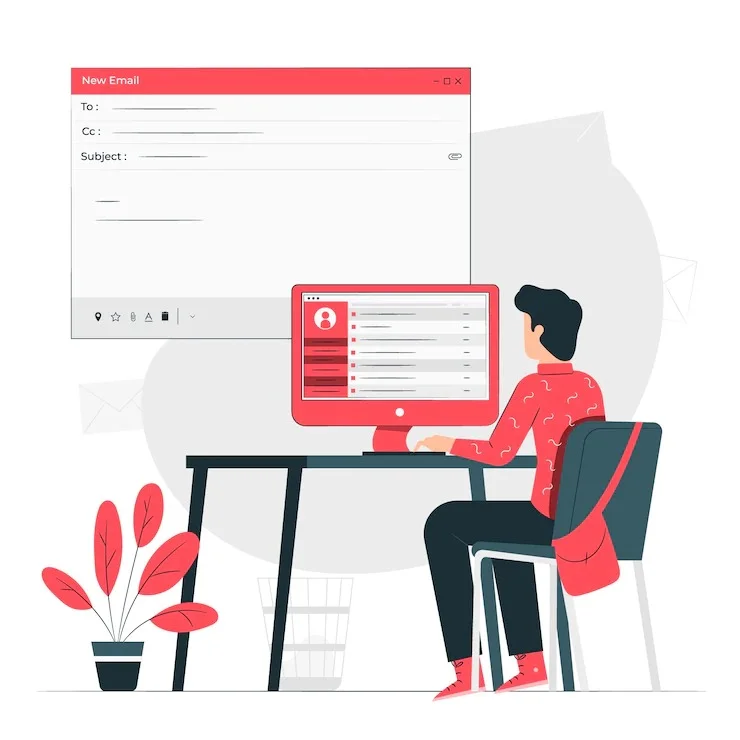
Despite the popularity and rise of mobile chat and message apps, email remains a crucial aspect of daily online life. Four billion people used email globally in 2020, and that number is expected to increase to 4.6 billion by 2025. Globally, 306 billion emails were sent and received per day in 2020. In 2025, it is anticipated that this number would rise to over 376 billion daily emails. Recent market data demonstrates that the move towards mobile also applies to email: in December 2018, 43% of email openings occurred via a mobile device. Webmail accounted for 39 percent of opens, while desktop email clients’ open share fell to 18 percent.
Your email design needs to be on point if you want to make sure that your emails stand out and capture the attention of these audience members.
Best practices for email design:
Make a compelling topic line (subject line).
When you send someone an email, the subject line is the first thing they see. It is a succinct phrase that is meant to catch your audience’s attention. It should pique their interest and entice them to open and continue reading your email.
A great subject line will possess the following qualities:
Try to use as few words as you can to capture your readers’ attention (remember: less is more).
Give the receiver something of value to encourage them to open the email.
Include a summary of what recipients will read, see, or do when they open the email.
Create an eye-catching pre-header.
Similar to the meta description of a web page, your email’s preheader gives a brief summary of the content of the message. The second thing that recipients see is it. You can personalize the pre-header to give your subscribers a preview of what they can expect to read in your email rather than changing the opening line.
Be succinct.
Give email recipients the details they require without going into great detail. This will demonstrate that you value their time, which may help you increase the retention of email subscribers.
Keep your email consistent with your brand.
Use an email tone that is consistent with your other content and marketing pieces (like your website and social media).
Use the same fonts and colors throughout your branding and marketing materials.
Include calls to action (CTAs) that are pertinent to your goods or services, your logo, a link to your website, links to your social media profiles, and all of these.
Consider your layout.
Consider user experience (UX) while planning your layout; that is, leave blank/white space and arrange your textual and visual information such that it is well-organized, understandable, and easy to traverse.
Make every email unique.
A customized email that is tailored to the receiver will come out as more considerate, expert, and personable. Personalizing your emails can also help you humanize your brand. By adding a personal touch, you may strengthen the bond between your company and email recipients and increase retention rates.
Include original visual material.
Be confident using emojis.
Make your design responsive.
Add calls-to-action to your email to improve it.
Include a button to “unsubscribe.”
Create a signature for your email.
Design Tools for Email Here are a few well-known examples of the numerous email design tools available, some of which have features completely unrelated to email design!
Guide to using Mail Designers:
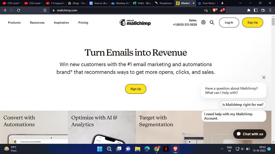
Create an account with the mail designer you want to use, in this case, we have chosen MailChimp
After an account has been created, you will see the following page:
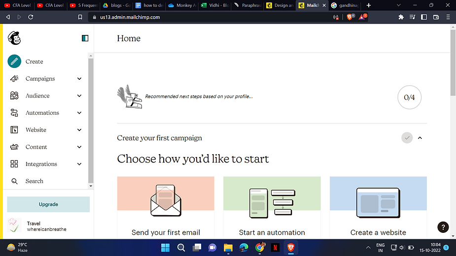
By clicking on the create button, you can design mail. Using the campaigns feature, you can design a campaign you are planning, likewise for the options of the audience, automation, websites, and content.
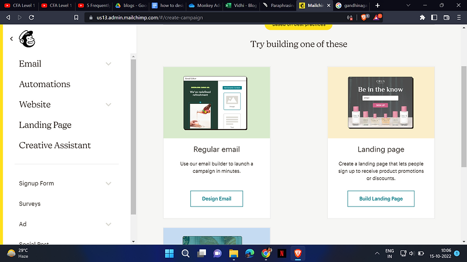
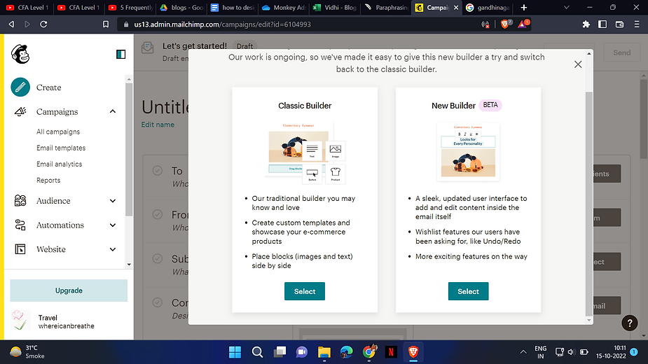
You might not have access to all of the template options depending on your plan.
The many template categories and the items they contain are shown below.
Layouts
Featured and Basic designs are included in the layouts category. The featured templates were created with a few objectives in mind. Each template has content blocks that may be customized and used to promote new products and other things. Standard templates come in both standard and full-width variations. Each campaign section’s background is extended by full-width templates to fill the width of the client being used to view it.
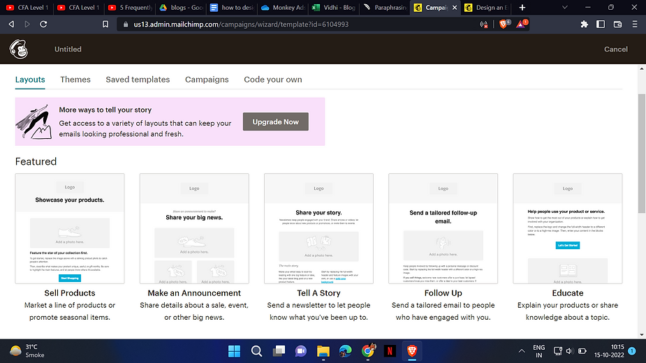
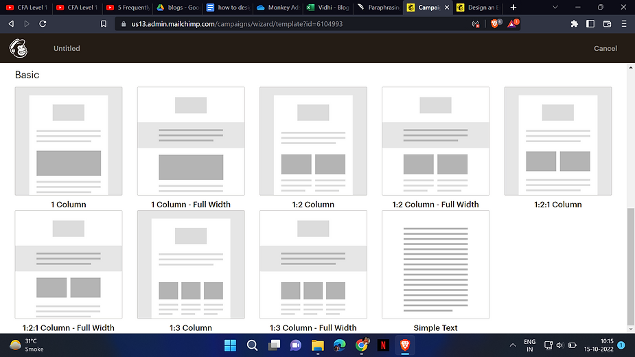
The design process comes next after you select a template. To add and format text, upload images, link to files, and more, use content blocks.
Every template has text and picture placeholders to assist you in starting to construct your email. You can add, remove, rearrange, and replicate content blocks to achieve the desired appearance and feel depending on the template you select.
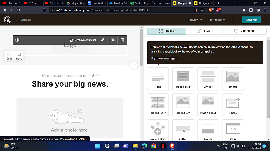
Drag and drop the content blocks.
You may quickly duplicate, remove, and rearrange content blocks with our drag-and-drop editor. To change the appearance and feel of your campaign, drag and drop different content blocks into your layout and reorganize them as needed.
Add text.
Direct typing into the content block editing pane is the most effective technique to add text to your campaign. Use a straightforward text editor, such as Notepad or TextWrangler, to copy and paste your material if you prefer to work outside of the campaign builder.
Avert using Publisher or Word, which are both rich-text word processors. They include text styling code, which may make it impossible for you to design material in the campaign builder. Click the Paste as plain text icon on the editor toolbar to add text that you have copied from a website, email software, or rich-text editor.

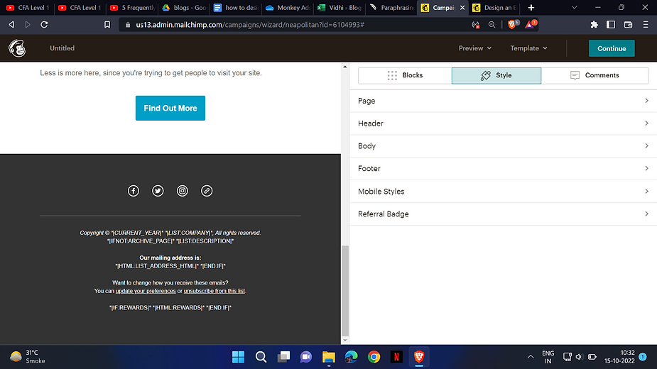
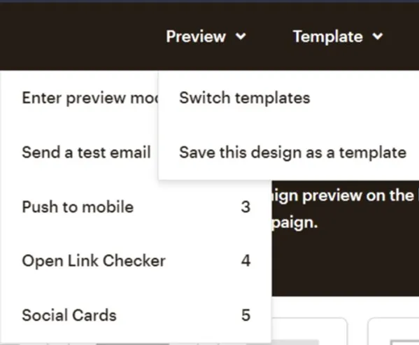
After you are done designing your mail, you can preview and test it using the preview feature on the top bar, you can send a dummy mail to your own self before sending the final ones to the audiences. Saving or switching templates is also possible.
The blog is compiled and written by Ms. Vidhi Thakar who is a content contributor on our website. If you have any questions or feedback, kindly please write back to us.
Let’s Build a Lead Machine for Your Brand
Stop wasting ad spend.
Start building a scalable, predictable growth system.
send us an e-mail
with your inquiry.

